Creating a new data driven app at Gumtree - 1
Luke, 07 Aug 2024
Introduction
Ive spent the last two years at Gumtree UK as principal engineer on the iOS team. Gumtree is a well established online classified advertisement and community website and app. It was established in London in 2000, so its 24 years old and still going strong. It was acquired in 2005 by eBay and stayed with them up until 2022. Their first native app was created around 2011 on both iOS and Android. Our team was lucky enough to be given the green light to rewrite both iOS and Android apps, and to provide a new BFF (Back end For Front end) layer to provide data to those new apps. For two years myself and the team totally redesigned everything about the apps: not just the appearance, but the architecture too. This article aims to give a high level look at the some of the design and architecture choices we made, and why.
Why Rewrite?
Its rare that you get chance to rewrite an entire app, when you already have one thats so well established, with so much functionality. Why take that risk? In this case, business requirements really necessitated it. After eleven years in the hands of many many developers and crossing through huge changes in the tech, from Obj-C and xib files, into Swift and Storyboards, then further on into declarative development and SwiftUI, this codebase had it all. Although many devs had clearly done their best to separate concerns and isolate areas from each other with a semi modular architecture, it was at times hard to even get the code to build. Wading through the sheer volume of written code took much time and really slowed down any kind of innovation. There were basic shortcomings: the app had zero accessibility for example. For an app serving millions of people regularly, from all walks of life, this was pretty unforgiveable - but given the scale of the codebase, it was also an impossible dream to put right.
Gumtree had new owners in 2022 and hence, a chance to turn things around. Little innovation had happened for probably 8 years, and things were feeling old and stale. A new UI design was called for, that could help Gumtree compete in a marketplace that was now crowded with apps like Vinted and Schpock, themselves much newer and slicker offerings. I had significant experience at this point with newer tech like SwiftUI, which could offer potentially much quicker development times for the rewriting of a large app like Gumtree. I created a proof of concept app to highlight the speed with which we could rewrite the app: within a few months the main homepage and listing detail view had been written and I could demonstrate accessibility and things like light / dark mode out of the box. Management were encouraged enough to greenlight the full creation of a rewritten app, featuring a brand new design too by the excellent Gumtree design team. The chief motivation really was to give Gumtree a platform with which the company could quickly iterate and innovate, being able to develop and deploy features with speed, unencumbered by legacy code and systems. We were able to start in Jan 2023.
What we had before- the legacy app
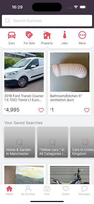
What we came to know as the legacy app, was built much like many apps from this period. The app would connect to a large monolith backend, that would deliver also very large XML files to each app, containing all the data required to build each screen.
The screen themselves, in terms of content, would be hard-coded. The layout of a typical screen like the homepage would consist of a large UIViewController file in the app code, containing all the programmatically described elements required by design: a bar at the top for different category searches, a search bar, a tab bar at the bottom, etc. The app would download the xml for the screen, and each screen element would be populated with the data. I wont go into too much detail here: its a simple setup. Essentially the layout of each screen is hardcoded in the app code. In terms of changing a layout, adding a new element, re-ordering things, etc - its a normal process of: update both apps with the requirements, manually adjusting the hardcoded layout. Add new network calls for the new elements, or change current ones. Add new code to the backend, or modify it, to support the new layout. Build, test, release through appstores, test out in the field, etc. Its a normal way to do things, but its cumbersome and a bit slow, and there are better ways.
The vision for the new app
With the new app the desire was to create something much more flexible, and data driven. We wanted to be able to have remote control to the layout of lots of the app, more directly and instantly. For example, we wanted to be able to instantly change the number of listing rows that would appear, before being interspersed with other elements, like saved searches, or offerings like item delivery. Or to have remote control over the order of filter chips, to add new ones, take some away. Changes like that shouldnt really require the process described above: design; change both apps; test build deploy release; change backend too; deploy that, etc. The dream was that a simple data change, instantly deployed in the BFF, would be enough to make those changes and see them instantly - while keeping the app as fast performing and native as possible.
The BFF to achieve this was to be written in Kotlin. The apps would request data directly from this BFF, for each screen or area they require - the BFF then talks directly to the existing backend services, amalgamating the results on the server / BFF side, to be sent to the apps in precisely the format they need, without any additional excess data bloating each call. The advantages are many: the apps are only sent the data they need, so the traffic volume is immensely redecuded. In lots of scenarios, no app changes are necessary at all, so no building, testing, releasing. Much less data is sent, reducing costs and enhancing performance. Instant changes means we can quickly test things out and quickly change them back if necessary too.
Driving the new UI
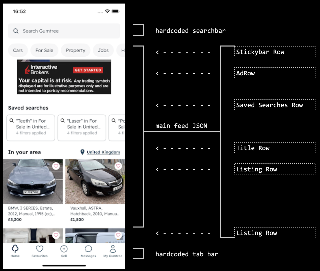
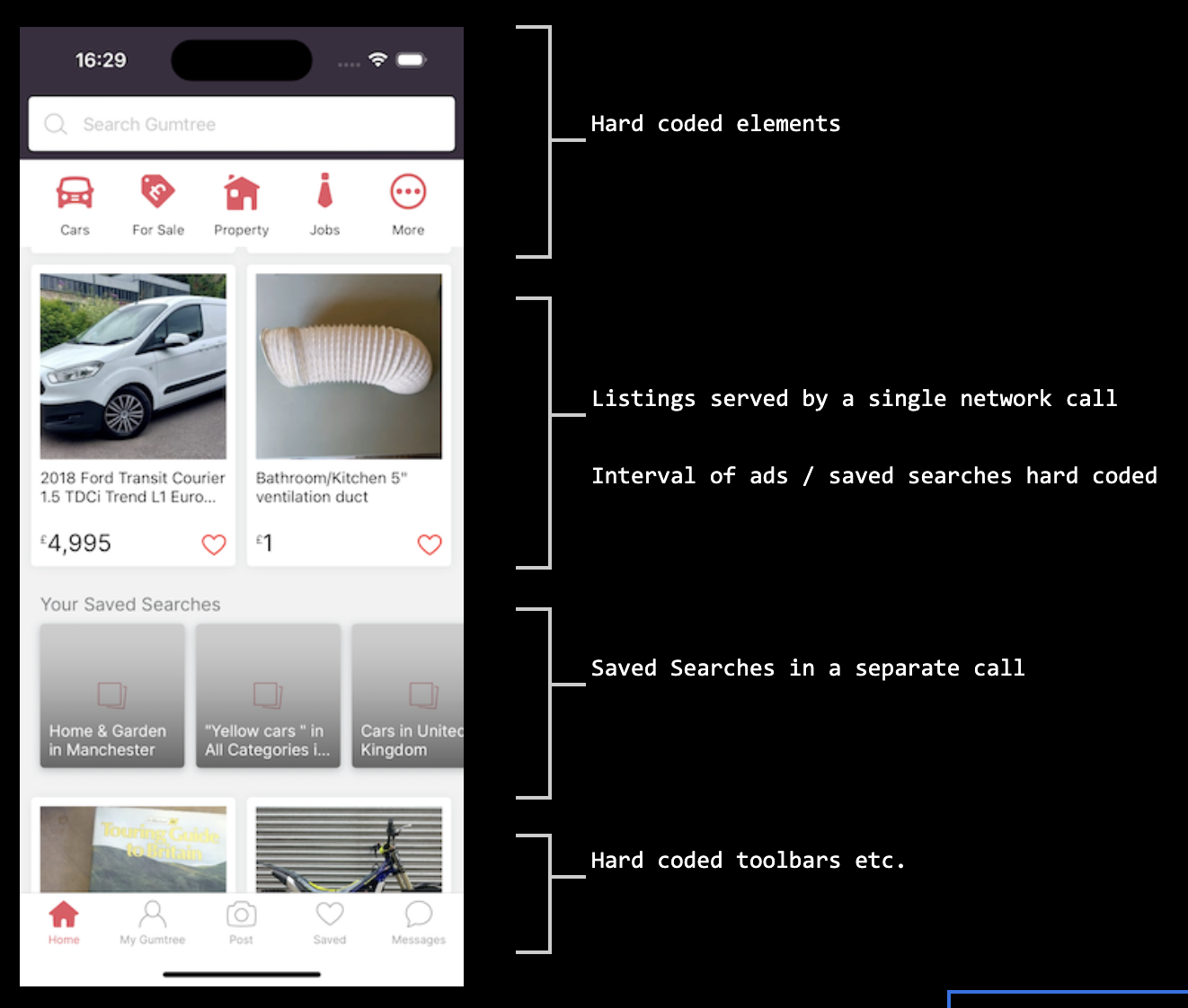
To get more into detail, heres how the new flexible UI would be driven by the BFF in both apps. In the new app, the only on screen elements that are hard coded are the top search bar and the bottom tab bar. In other screens its even less - generally just the tab bar. All other content is sent from the BFF in json form, containing mostly elements we called Rows. There ended up being a fairly large collection of Row types within an enum, covering things like ListingRow, AdRow, SavedSearchesRow, etc. Each would have an associated type containing the data that the row needs to be displayed.
Whats important to note here is that the order of the data in the rows now matters. If in the json there are two listing rows, followed by a saved search row and then a todays picks row, then that order is what the user sees on the app, where previously that order was controlled on the app side. If a stickybar is in the data, then a stickybar will be added to the top of the screen. If that contains a chips row, then a filter chips selector will appear inside the stickybar. If the order or number of chips in the row change, then the filters on screen also change. And so on. We are now able to configure a huge amount of the screen content directly from the BFF, with really simple quick changes and simple deployment. Each element also contains its own navigation information, which will with minimum work on the appside, automatically navigate through further screens as required - for example a listing advert will contain the navigation info that will then launch the item detail page, showing the correct ad.
Heres a short snippet of a row in that JSON feed to give you an idea of what its like. You can also see the destination/route object, which the app uses for internal navigation.
{
  "title": "Home Feed",
  "portraitData": [
    {
      "type": "HOME_FEED_SAVED_SEARCHES_ROW",
      "data": [
        {
          "type": "HOME_FEED_SAVED_SEARCH_CARD",
          "title": "Cars in W1J",
          "subtitle": "1 filter applied",
          "destination": {
            "route": "srp?q=Sofa&locationId=10000392&distance=FIFTY&categoryId=1"
          }
        },
Fetching the data and the BFF
On appearance of the home page, a request is fired to the BFF to fetch the home feed data, while a skeleton loading screen shows in the app. The request contains info about the users location, map radius, and the page size they require. The request is sent to the BFF as a standard REST call.
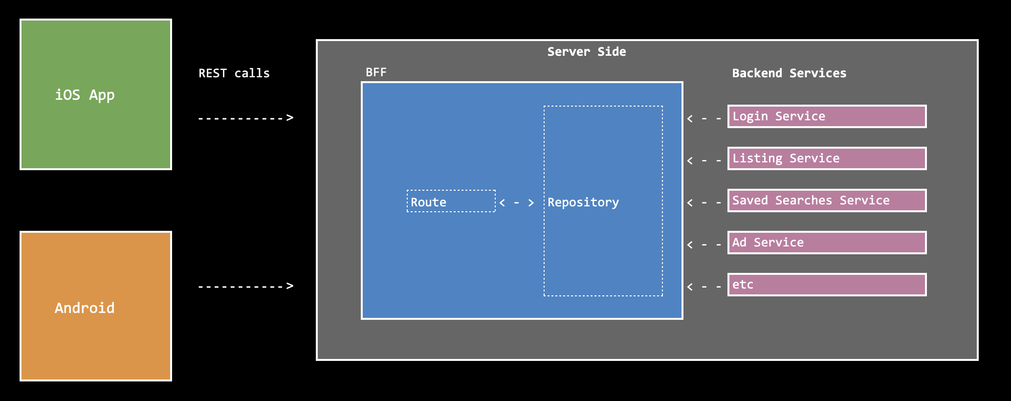
The BFF takes the request on the server side and can then communicate with various services quickly to collate all the information that the client needs to build the homepage. In the legacy app, calls to the backend had to be done separately - so a separate call to get the listings, a call to get the saved searches, etc. Here a single call goes to the BFF, and if multiple calls are then required from the BFF to other services, they can be done with optimum efficiency and speed all on the server side, before returning the results in a single response tailored to the client. The result is much less traffic, and much less calls from client to backend- resulting in a faster app with better response times.
As previously mentioned, the BFF is written in Kotlin. It has a fairly simple architecture consisting per feature, of a Route object which accepts the call information from the client and sends it on to a Repository object, which builds the data. The Repository then connects to other backend services: a Listings service, Saved Searches service, an Advertisement fetching service, and then other local factories and providers that build more content such as the filter chips rows and toolbars. The data is combined into the desired order and then returned to the client in the size requested.
One important feature of the Row structure that we went for, is that it allows the clients to be able to read the screen even when they are unaware of a new Row type from a future version of the app. Because its possible to fail to decode one of the rows in the json but still continue, we are always able to load the home feed even when a row is of an unknown (possible future) type. The parser simply skips that row and continues to the next.
In part 2 of this write-up I explain in more detail about the architecture of the iOS app and how we consume the app data using a clean architecture, with an MVVM UI layer powered by SwiftUI.